LGS
Rebrand Lead · Identity & Website by IBM iX
Intent
A Quebec technology firm repositioned beside IBM, with 518 of its own people in the decision and engagement up 50%.
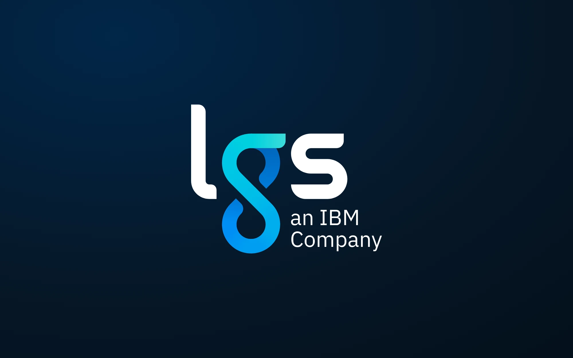
LGS, a $170M IBM subsidiary, has delivered technology services to private and public organisations since 1979. In 2020 it set out to rebrand for three audiences at once: its clients, the people it wanted to hire, and the people already inside.
As Strategy & Experience Lead at IBM's experience agency, I led the rebrand with a team of designers and developers, from strategy to identity to website.
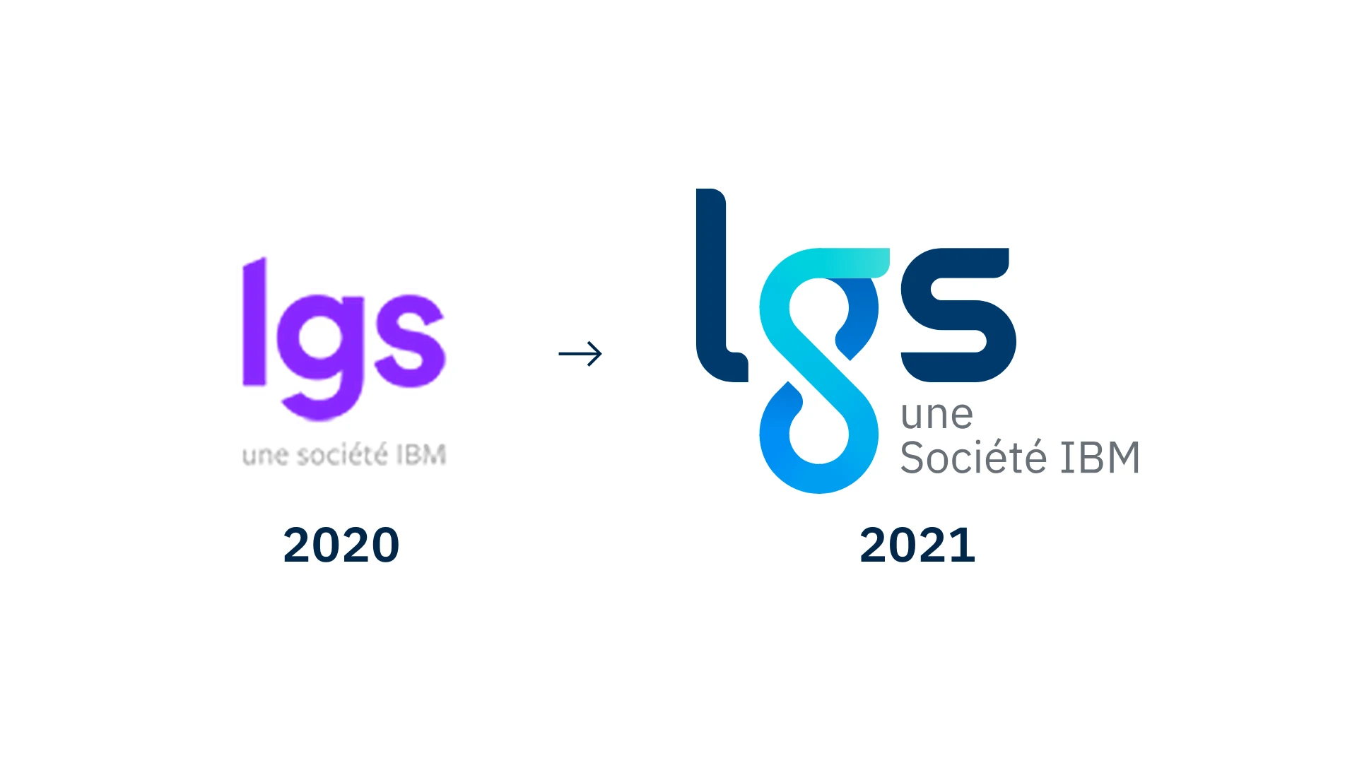
2021
The question
How close should LGS stand to IBM?
LGS already carried IBM's name under its own. Before any design, the strategy had to settle how much weight that name should take.
We laid the options out on a brand relationship spectrum and recommended the endorsed position. LGS leads and builds its own associations, and IBM stands behind it as the credential.
- 01Stand alone, with no visible tie to IBM
- 02Endorsed: LGS leads, IBM stands behind it
- 03Absorbed: IBM leads, LGS becomes a descriptor
The finding
We expected competence, and the room chose excitement.
We came in with a hypothesis: a brand led by competence, reliable and intelligent. In the workshop exercises, LGS's own people pointed toward excitement and sincerity.
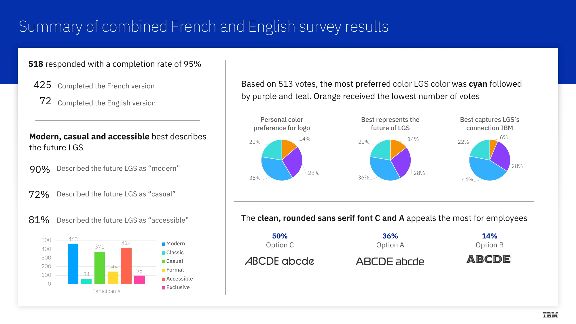
So the personality was reordered: excitement first, sincerity second, competence as the foundation. A survey then took the identity to employees. 518 answered, and nine in ten described the future LGS as modern.
The identity
Limitless.
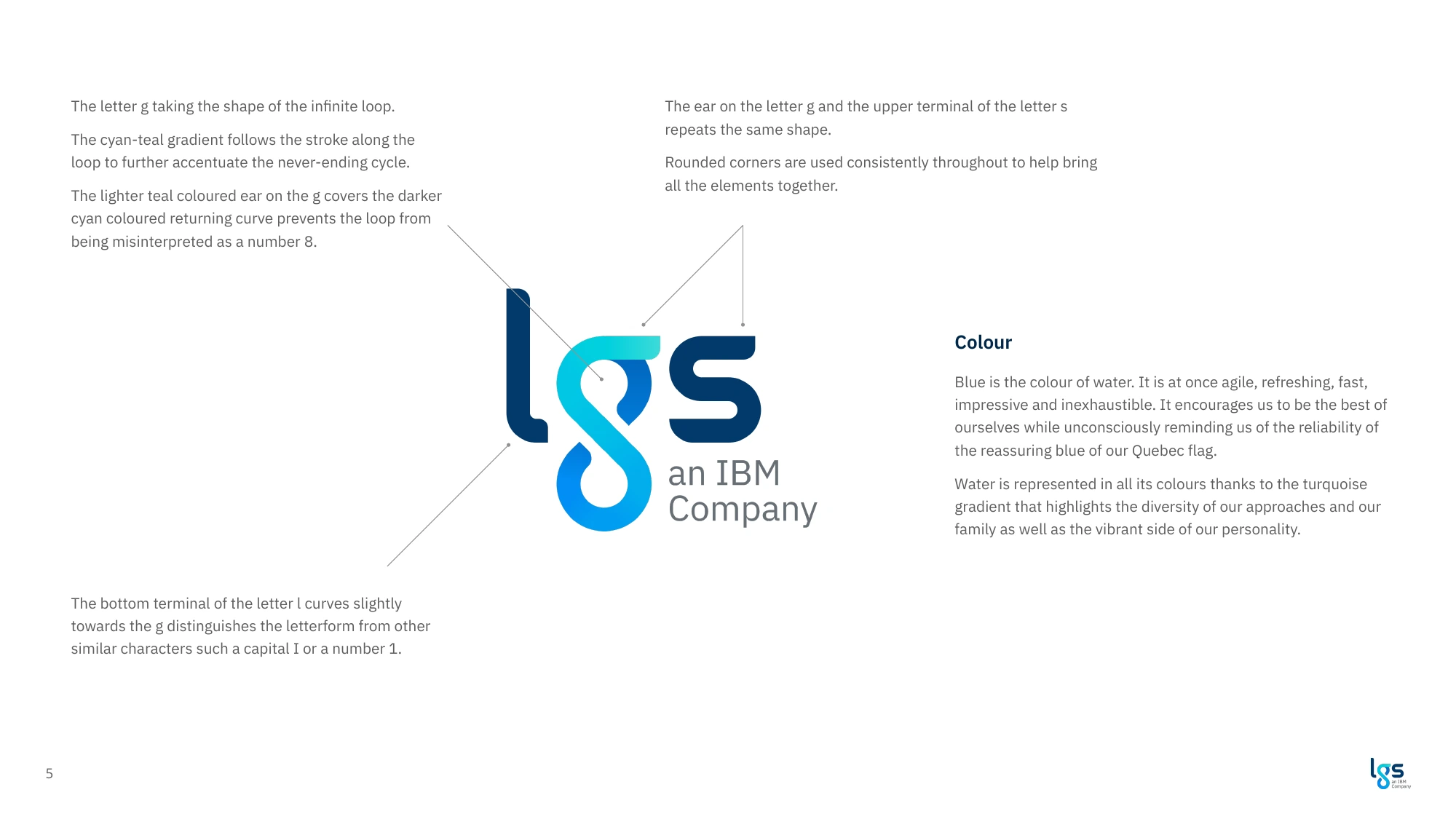
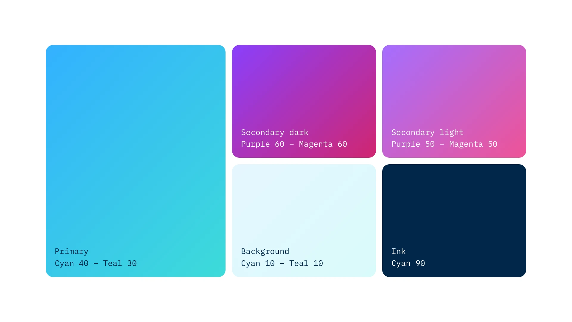
The g became an infinite loop, for a firm that keeps reinventing what it delivers. Cyan won the survey, and it sits beside IBM blue in IBM's extended palette.
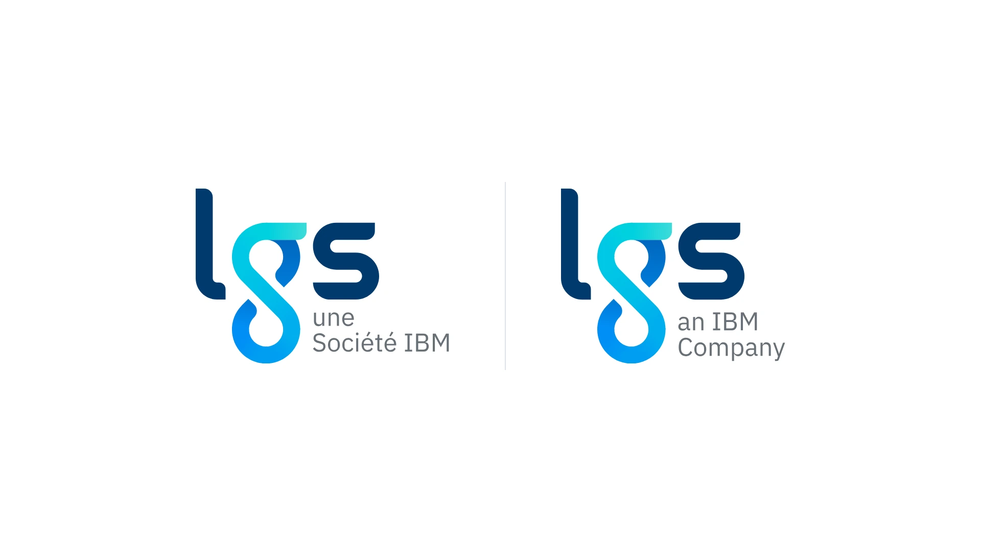
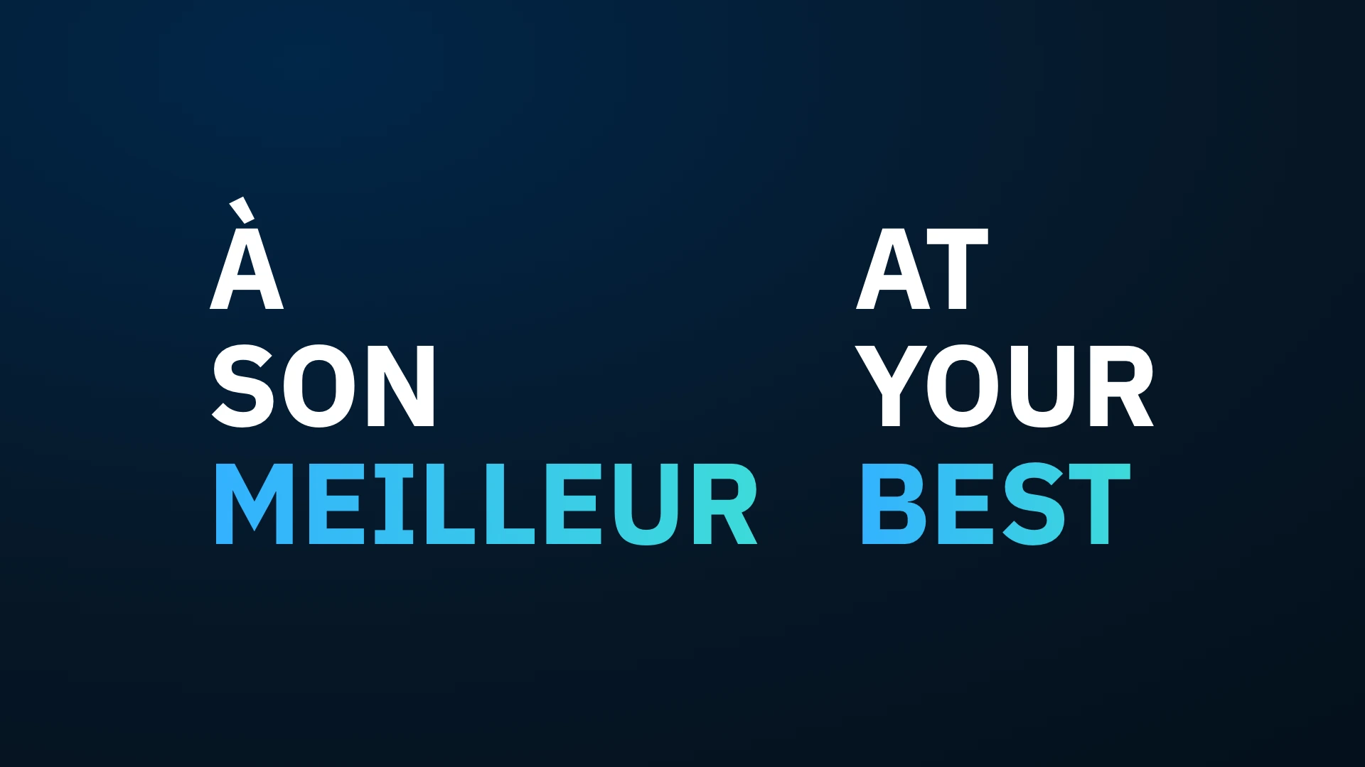
The logo was drawn in French and English, with the IBM line locked beneath it. The typeface, the tagline, "à son meilleur" and "at your best", and the new website followed from the same guidelines.
Results
What the work shipped.
50%+
01engagement lift
After the launch of the new brand.
30%+
02more followers
On LinkedIn and on Facebook.
518
03employees in the decision
The colour and the typeface went to a company survey, in French and English, before the identity was final.
5 years
04and still in use
Launched in 2021, the identity still runs on lgs.com.